
Brooklyn Arts Council

Brooklyn Arts Council
Together, a clarity of purpose and position fuel and guide brands in navigating the moving waters of culture. This is especially true in the non-profit sector, which requires successful brands to have strong, inspirational narratives that are pitch-perfect and authentic. To meet that challenge, Brooklyn Arts Council and Blackletter worked together to build a brand for the Council that sings with unmistaken purpose and position—a brand system that communicates the non-profit's empowerment of artists, commitment to Brooklyn, and characteristic integrity while employing a tone that is at once culturally relevant, courageous, and artist-centric.
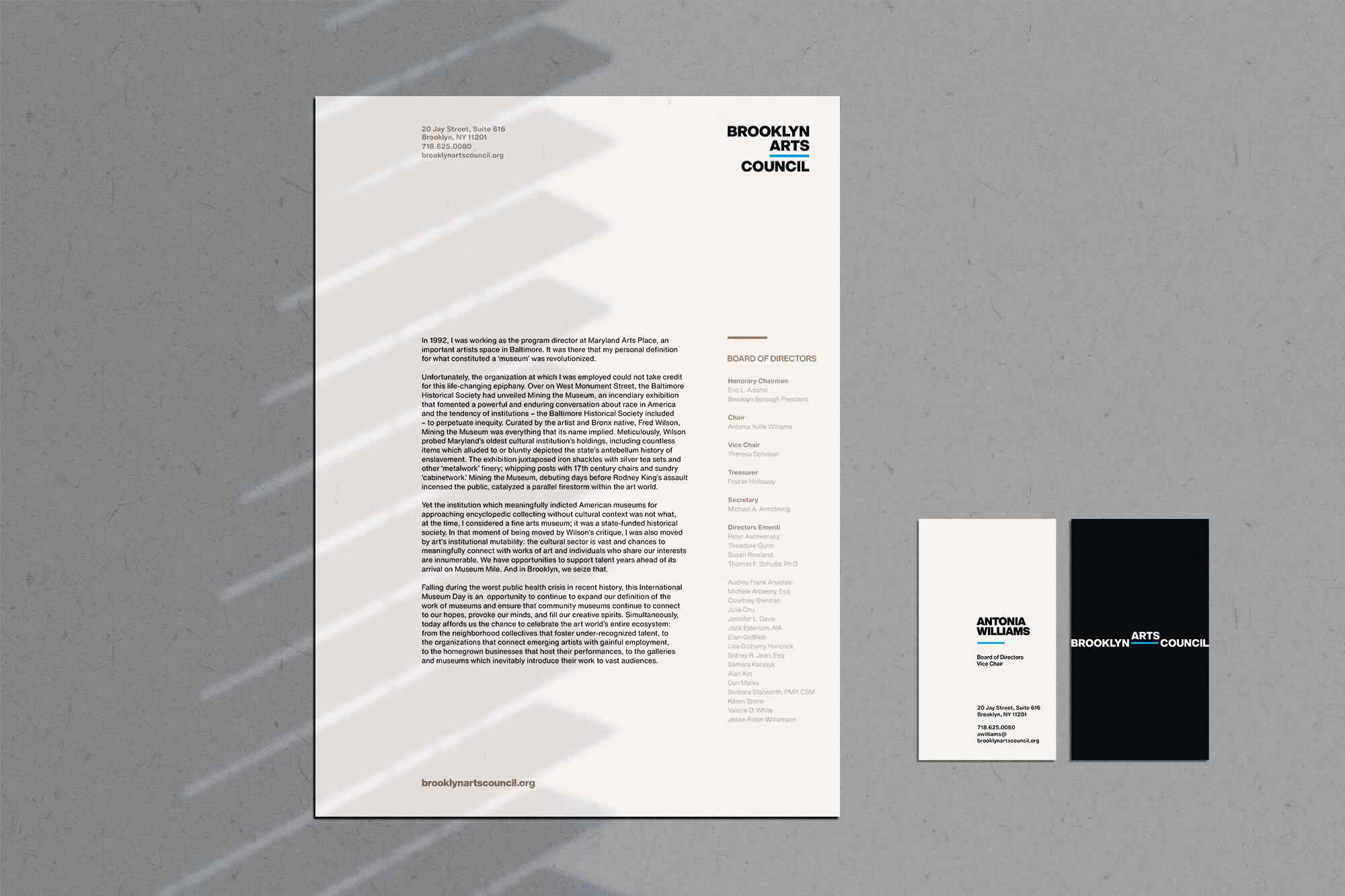
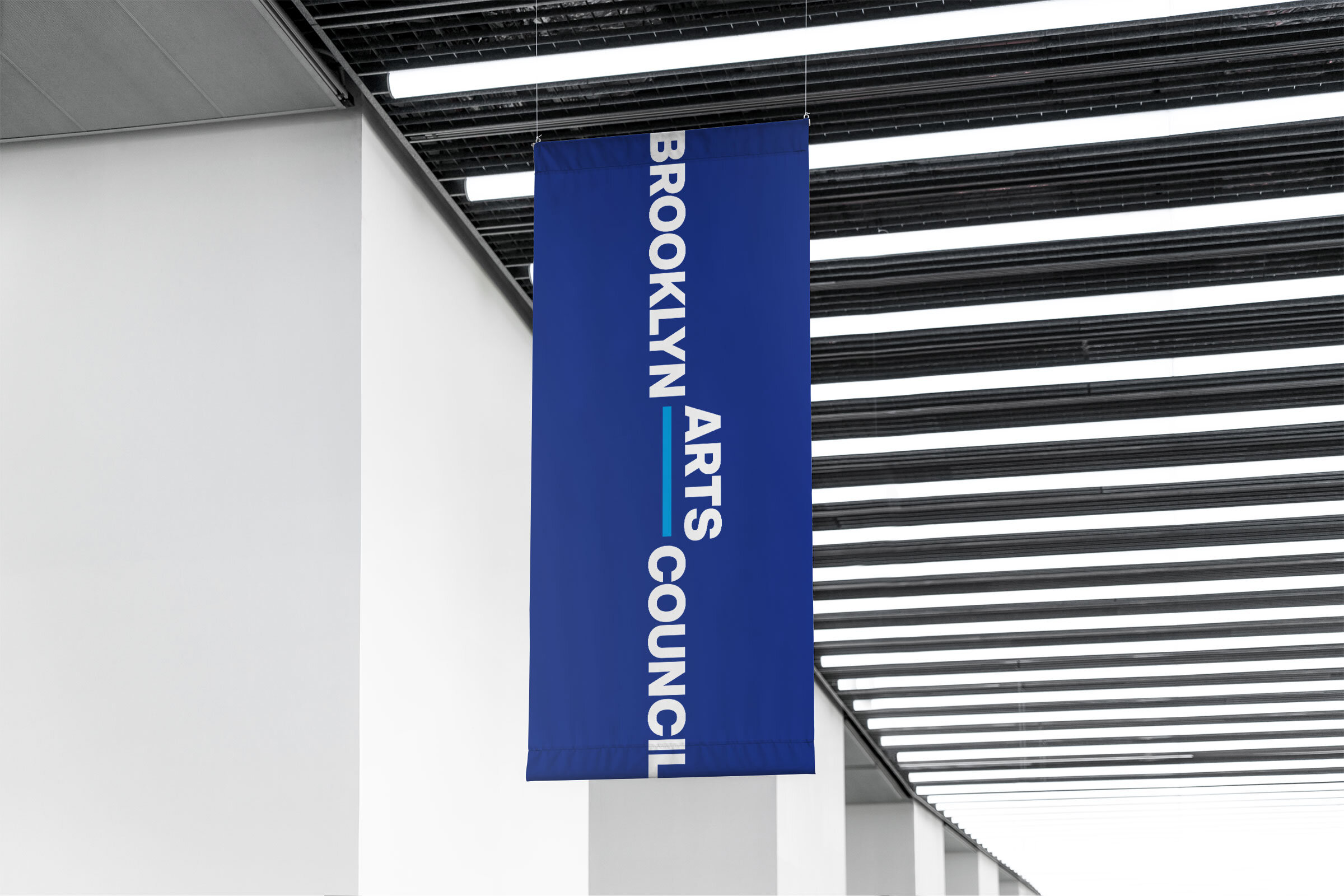
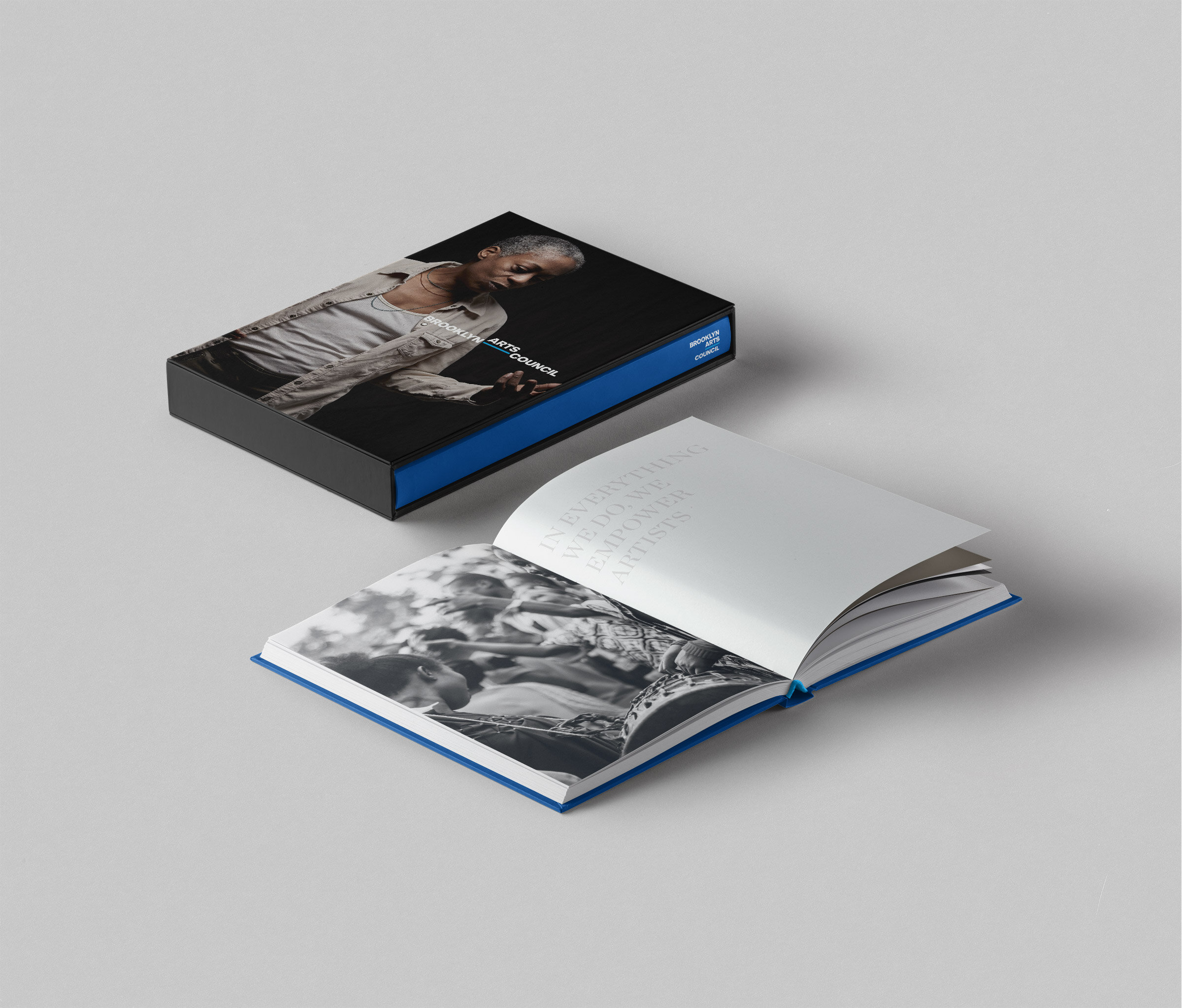
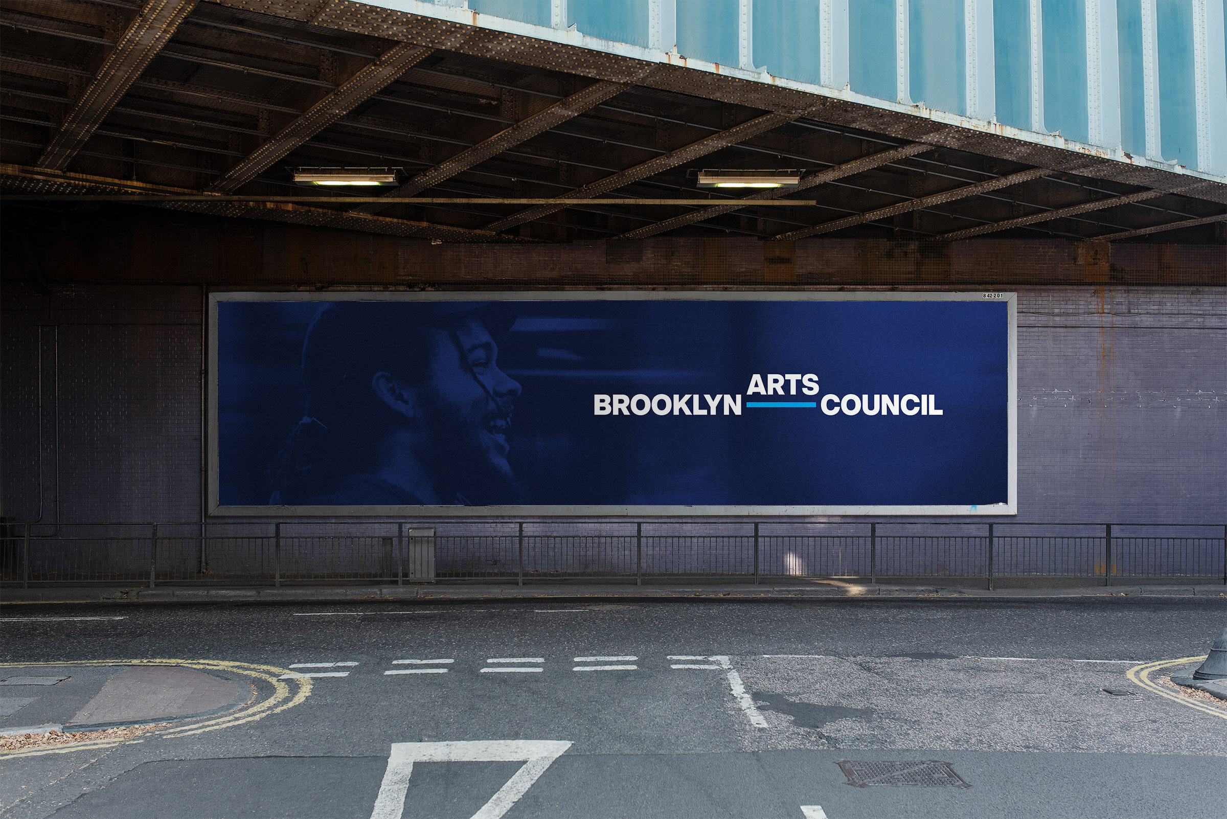
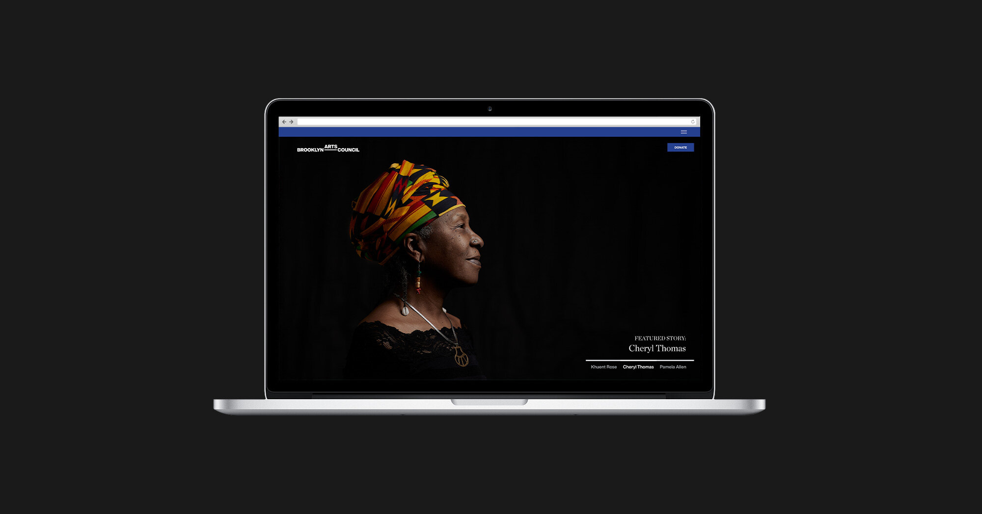
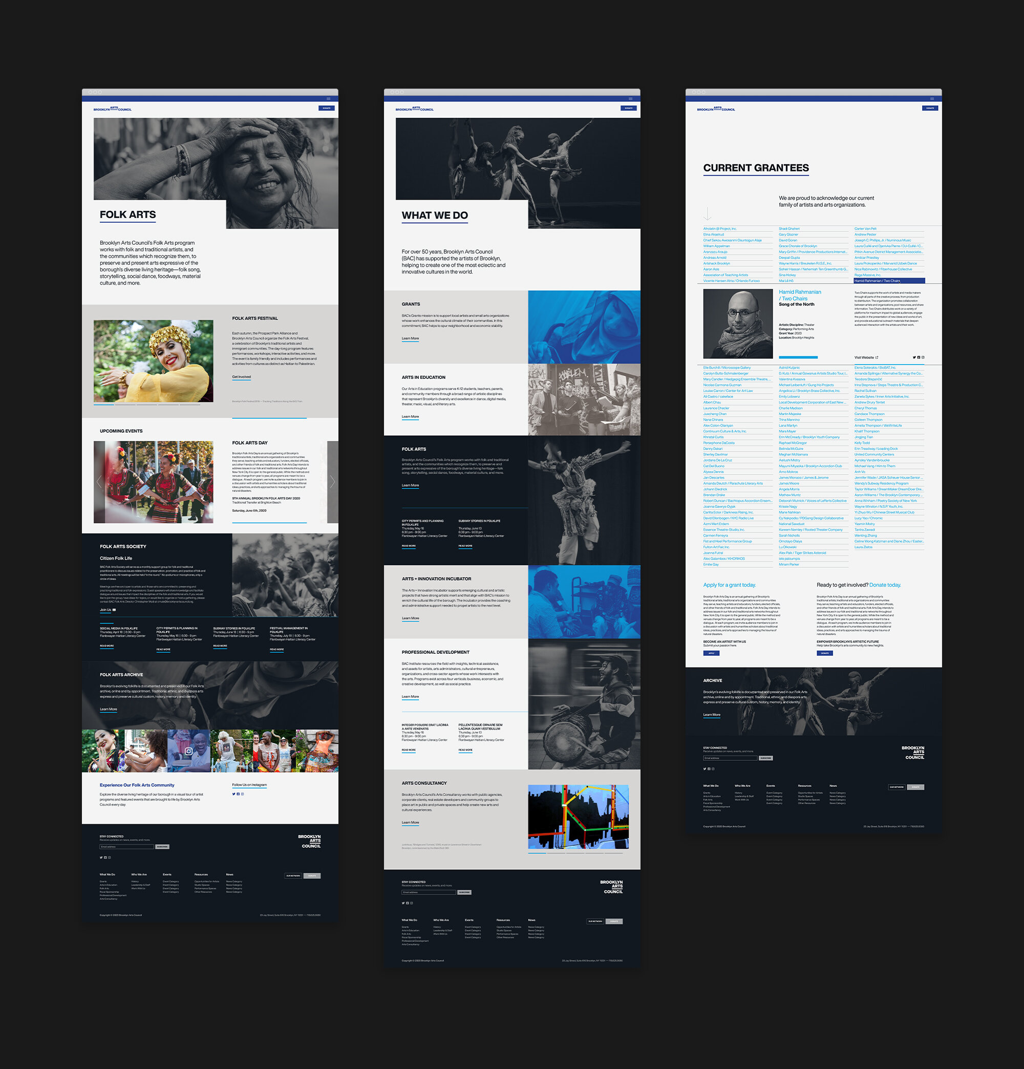
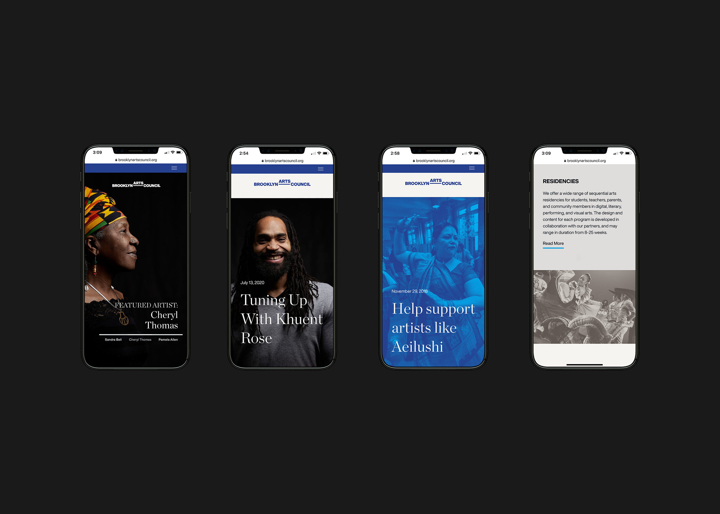
The new identity system is sophisticated and expressive, has a timeless, minimal logo, employs a modular grid system, and uses evocative imagery. It primes Brooklyn Arts Council to communicate who it is and what it does clearly, showcasing artist narratives and brand strengths in a redesigned website. With one look at Brooklyn Arts Council's new identity and assets, audiences understand quickly the purpose for which BAC exists.
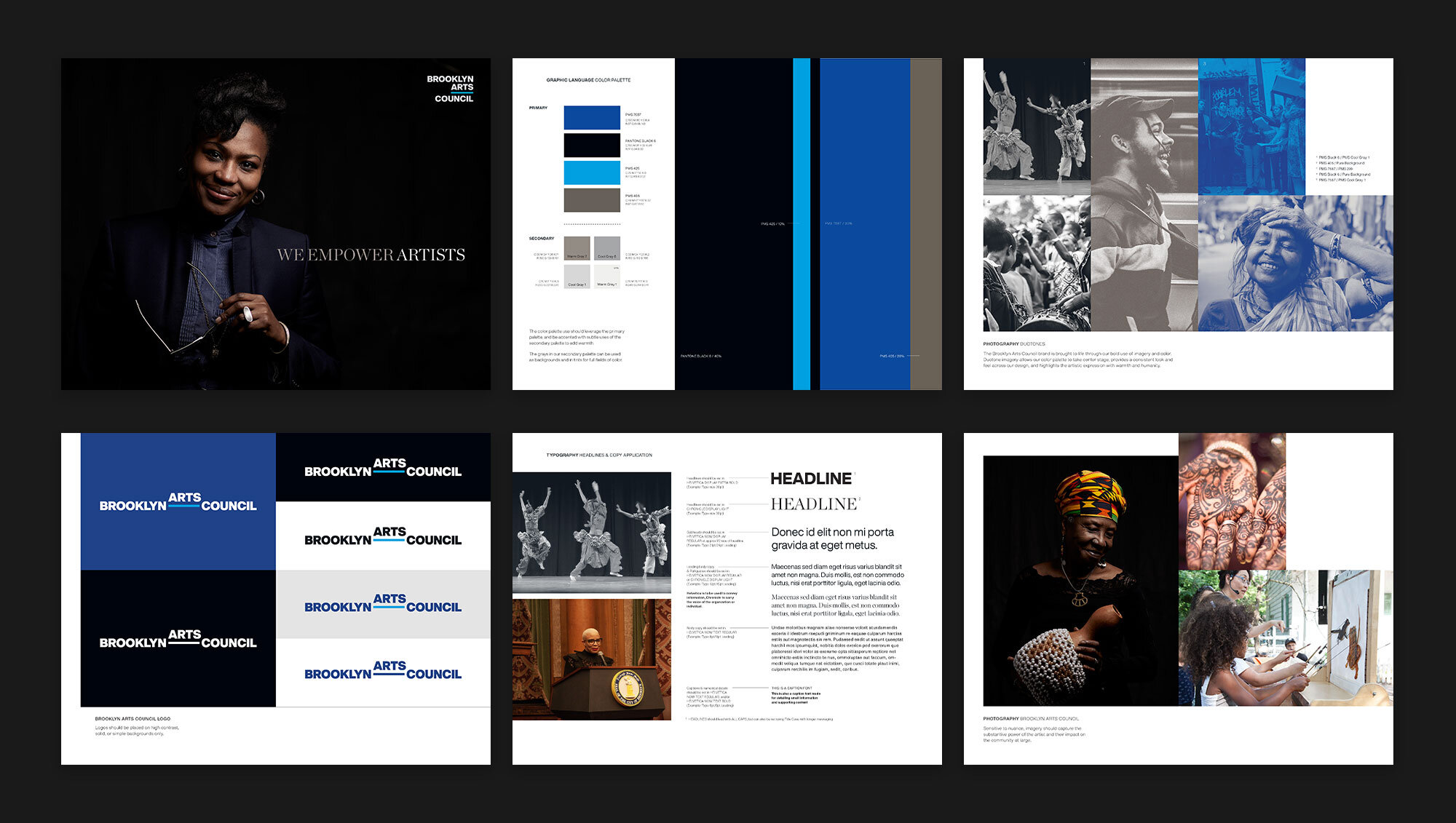
Central to the brand's raison d'etre is the idea of empowering artists. The logo started with that idea; it offers a visual platform, metaphorically elevating and celebrating the arts. The horizontal line acting as a bridge, connecting artists with funding and other resources, connecting individuals with their communities.


Services Provided
Research and Insights
Brand Strategy
Brand Positioning
Brand Promise
Brand Identity Design
Brand Voice & Messaging
Brand Narrative
Brand Guidelines
Web Design
Various Print Collateral
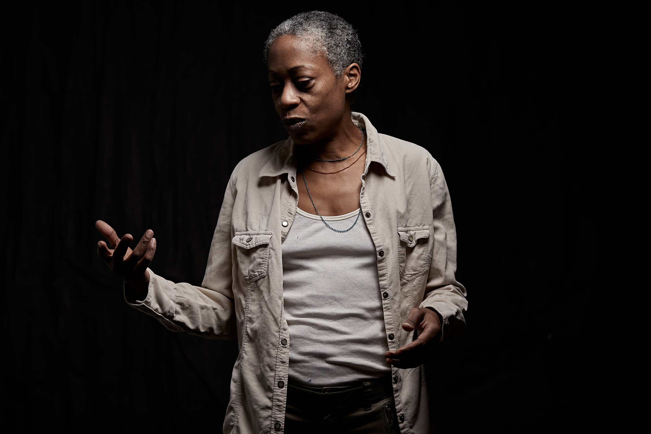
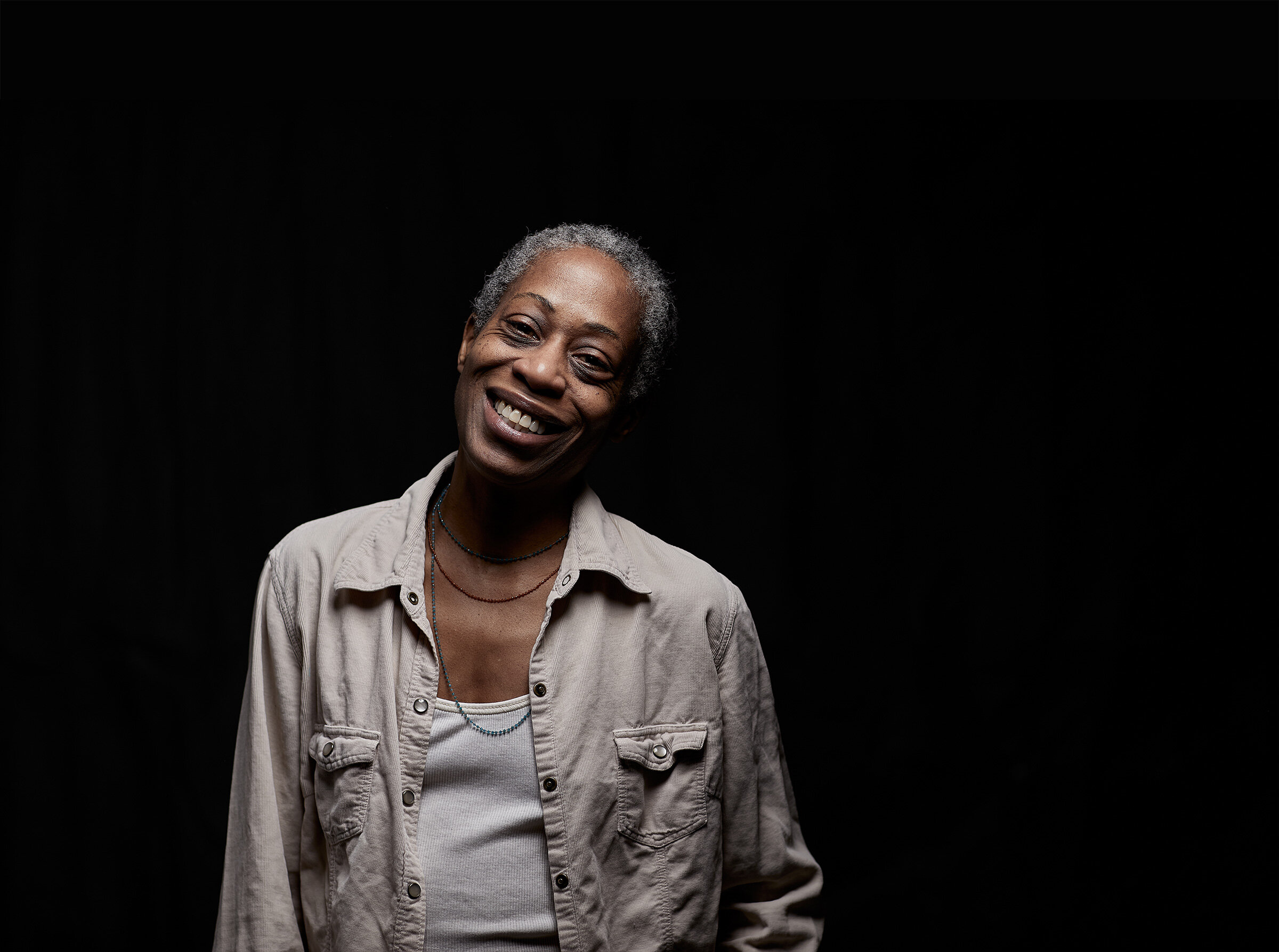
Photography